
Making FileMaker 13 Buttons Easy to Modify
FileMaker 12 and 13 give us a lot of new tools for making buttons look great. But if you want to use both an icon and text in your button you’ll need to make some tough decisions as this isn’t well supported out of the box.
The main issue is that while you can use an image as the fill for a button, you can’t position it to the left or right of the button’s text. This means a lot of folks are making their buttons completely in Photoshop–and making a separate image for each state (hover, pressed) in Photoshop as well. That works and looks great, but it often means heading back to photoshop when you want to resize or modify the button.
What We’re Doing
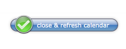
There are a lot of different approaches to this, and we’ll still make some elaborate buttons like the “close & refresh” button in our Pro Calendar. But what I’d like to show you here is what we’re doing for simple, everyday buttons. The kind that need to look great but get resized and changed all the time during development.
Feel free to jump ahead to the video below as it walks through most of what follows here.
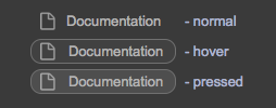
The big idea is that we wanted an icon to the left of our text, and wanted the icon to follow along with the hover and pressed states of the button. Ideally we did not want to have to make 3 versions of every icon, one for each button-state.
First version.
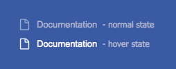
Here is what we tried at first, and you’ll see that the icon gets brighter, just like the text does, when you hover over it. In this way of making a button the icon is a fill of the button itself and we use a different fill image for each button state. This looks great but has a few big problems if we were going to use this technique everywhere:
- We need a different icon for each state, so if we ever needed this where hover wasn’t “white” we’d need to make a whole new set of icons.
- Since an image file doesn’t respect padding, we need to include the left hand padding of the icon IN the icon’s .png –another thing we’d have to keep track of through each of our button-state images.
- Also related to padding, we need to use a very cool/tricky hack of the “slice” option in order to get the image to stay to the left of the text. Though we ended up not using this kind of button, the slicing trick is worth looking at if you haven’t seen it.
Slicing.
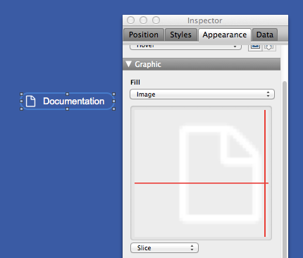
If you look at the image to the right (this is also demonstrated in the video below), you’ll see that we’ve selected the “slice” option for the icon, but instead of 4 red slice lines you only see two. That’s because we’ve moved the two horizontal slice lines to be on top of each other in the middle of the icon. We’ve done the same to the vertical slice lines: they’re now on top of each other to the right of the icon.
This effectively pins the icon to the left edge of the fill area. And you can see how we’ve left some “padding” IN the icon’s image file to the left of the icon: this is so the icon doesn’t appear smack against the left edge of the button when we click on it.
Remember, image fill’s do not respect FileMaker’s alignment or padding so we need to resort to stuff like this if we want to use image fills for button icons.
Current version.
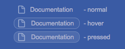
Ultimately we decided not to go with image slicing and padding and decided to keep the icon outside the button, as it’s own object. This means it can’t participate in the button’s hover and click states but with some careful use of transparency we can make it look like it does. Most of all, this technique means we only need one icon image and can resize our buttons as we see fit.
A couple of things to note about this technique:
- The icon is a separate object behind the button. Behind is important both for Web Direct (which can’t “click through” objects) and for making the icon appear to brighten slightly when hovered or pressed.
-
Same buttons on a gray background The hover and pressed fill colors are white with 4% or 10% opacity. This means they look good on almost any darker background and we don’t need to change that up just because we move the button to the dark-grey header or a layout, for example.
- Same with the stroke on the hover and pressed states: white with 28% opacity so we don’t need to change it often.
- The icons themselves are also slightly transparent so they also look good on almost any dark background. We make our icons in Photoshop or Pixelmator, but if you want a simpler way of adding some transparency to your icons, check out Matt Petrowsky’s Theme Studio.
- FileMaker 13 won’t let us change the opacity of text… log your feature requests here =) …so we do need to change the text color when we place the buttons on a different background. BUT, since we didn’t alter the text color in any of our states, we only need to change this once, not once per state.
Again, there are a lot of different ways to approach FileMaker 13 buttons. We decided to optimize for ease-of-modification while still making something that looked cool and responded to different states. We’d love to see how others are constructing their buttons and icons.
Video.
Here is a walkthrough of all the stuff we discussed above. Some things, like the slicing, are easier to see in action…
[ba-youtubeflex videoid=”kR4OrGInrvs”]
Links to Tools Mentioned:
ThemeStudio for FileMaker (for making icons)
[ba-box background=”#778899″ border=”#708090″ textcolor=”#F7F7F7″][jetpack_subscription_form][/ba-box]
3 Comments
As always, nice walkthrough, John. I use virtually same technique, but I use the indent value (say 22 or 24 depending on desired look) with a 16px icon. Then no need to adjust padding per state. Let me know if I’m missing something.
Was psyched to see your comment, Michael, and rushed to try using indent instead of padding (just because we have new tools, does’t meant we should use them, right?). But it looks like padding and indent share the same issue: if you have a button outline in one state but not in another the text will shift by the line width as states change. I guess you could have a line in all states and just make it fully transparent in states you don’t wish to see it. Too hacky?
[…] Video.Here is a walkthrough of all the stuff we discussed above. Some things, like the slicing, are easier to see in action…See on http://www.seedcode.com […]