Been really enjoying the Material Design stuff coming out of Google.
 They seems to be focusing on the right issues, even if some of the results aren’t what I’d always do. Most of the time I find it’s just great to have a guide to follow–especially around typography and spacing–where otherwise I can just start trying things and pretty soon I’ve spent a couple hours tweaking fonts…
“I know white text on black is too jarring, but how off-white should I go, and how much should that change with font size?!”
Nice to have guides for that kind of thing. =)
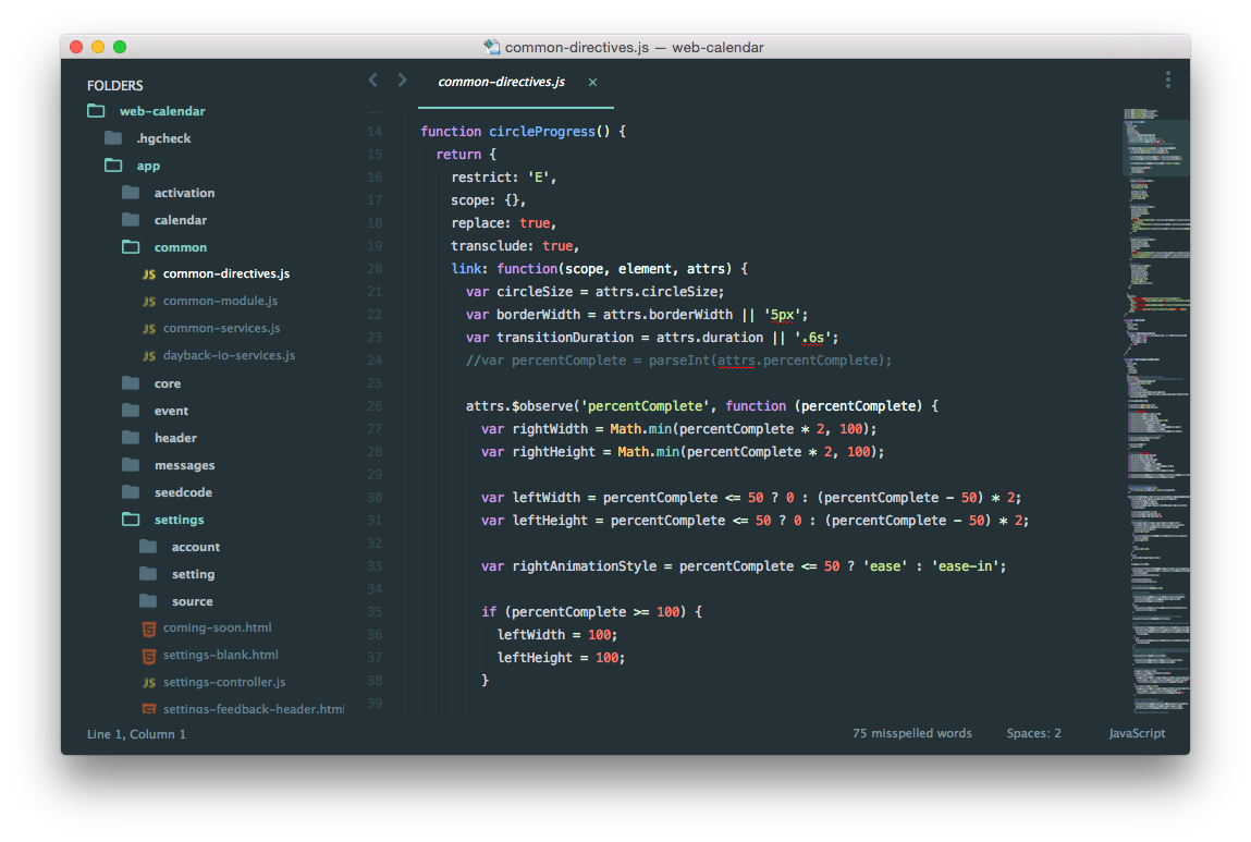
Tanner also turned me on to this great Material Design theme for our favorite text editor Sublime Text 3. Here is a before and after:
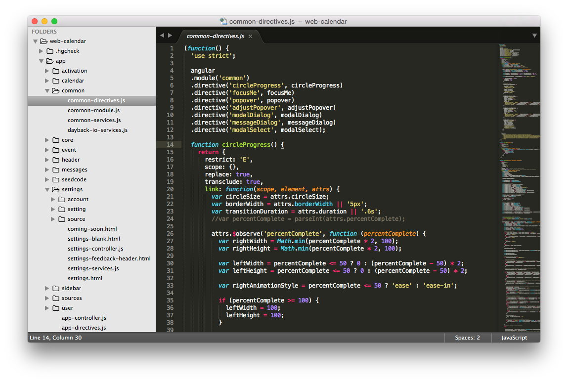
Been using Sublime a while now and still can’t get over how nice it is to have all the settings and preferences as a text document that you edit in Sublime. That means you can try new settings, comment old ones out, and easily share settings with your team. My favorite setting recently?
"spell_check": true,
Sigh.
If you’re new to Materials Design, here are some places to get started.
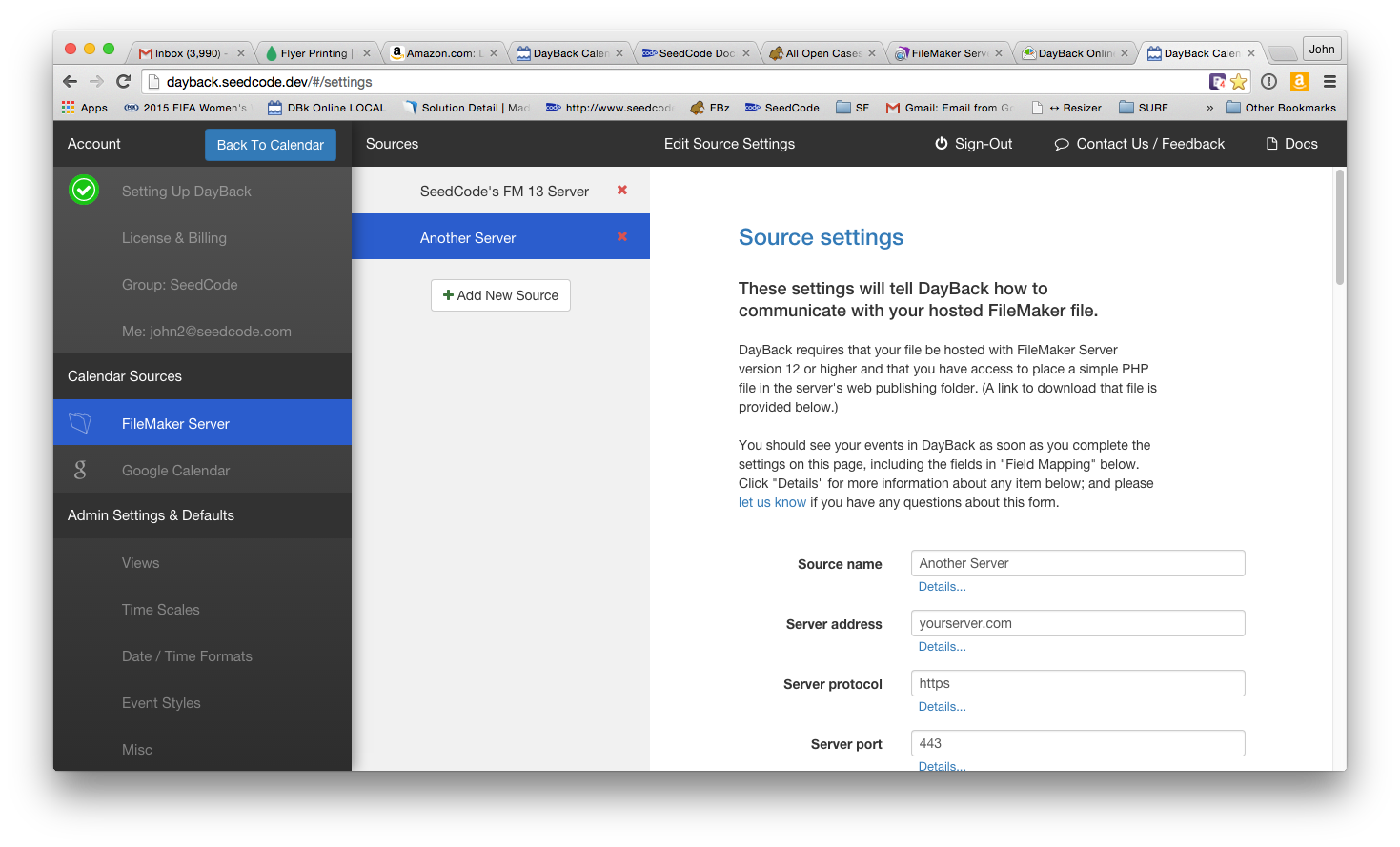
And if you’re building anything around these guidelines, we’d love to see it. We’re incorporating this in small ways into the Settings side of DayBack Online (a version of DayBack Calendar for browsers and WebDirect… coming soon):