
Calendar Analytics
Introduction to Calendar Analytics
Analytics adds a chart to your calendar, so you can quantify data across the days, weeks, and months you're looking at.
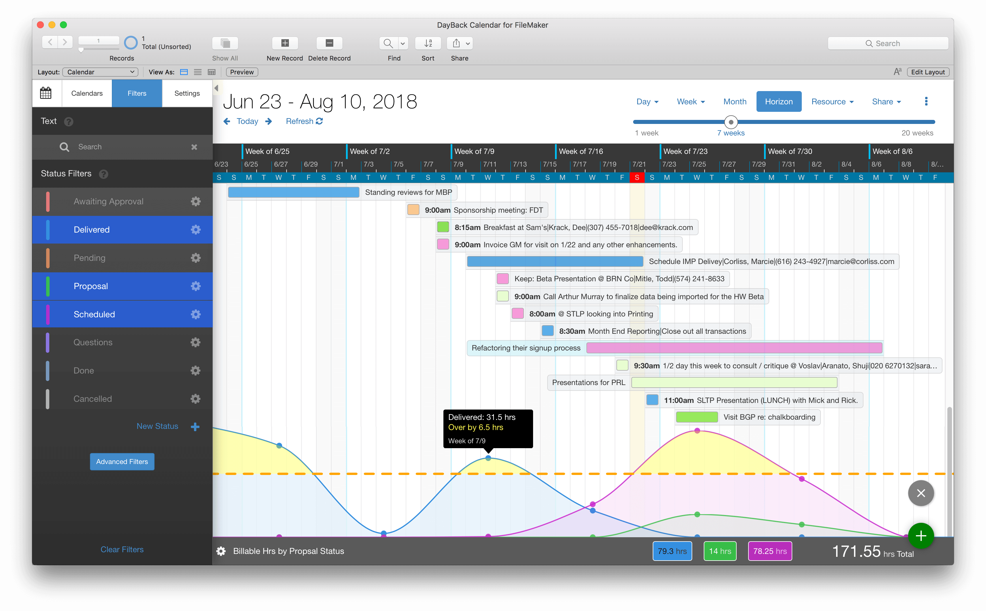
The chart responds as you reschedule items so you can quickly see if your plans are lining up with your goals. Now you can see the consequences of your decisions right in the calendar.
Analytics is designed to answer questions like these:
When do I need to begin work on this project?
Do we have the capacity to take on this new job?
Have I blocked off enough time to meet this deadline?
How often are we exceeding our goals?
What's our estimated revenue three months out?
Learn more and view some use-case videos here: Calendar Analytics: Examples.
Chart Data: What Can I Measure
There are three options for charting your data.
Additional Fields
Select this first option and you'll see a list of the fields available for analysis. This will include the additional fields in any currently selected source along with the title and description fields. You'll see just the fields you've set up as text or number fields--those are the only kinds DayBack can perform math on. And when it comes to text fields, DayBack can only include them in the chart if all they include is a number. So if your text field contains solely "6", that will get added to that day's/week's total; if the field contains "6 lawnmowers", it won't be included.
You're selecting the label of the field that you assigned when you set up the additional field in DayBack: this is the label that shows to the left of the field in DayBack's popover (except for the built-in Title and Description fields, which are just called "Title" and "Description"). So if you elect to chart on a field labeled "Est Hours", DayBack will include values from any active calendar source where there is an additional field named "Est Hours", even if the actual fields in the different FileMaker tables have different column names.
This means that if you give your additional fields the same names in DayBack you can aggregate data across different calendar sources. Pretty cool.
If you're using your own FileMaker layouts to edit event, instead of using DayBack's built-in popover, you may not have created any additional fields yet in DayBack' settings scripts and calcs: because the fields are just showing up on your layouts. You'll want to set up additional fields for any fields you'd like to chart with analytics; follow the instructions here to create them: additional fields.
For multi-day events, DayBack will apportion the field value across each day. So if you're charting an additional field named "Est Hours" and have 20 hours estimated for a 4-day event, DayBack will count 5 hours of that estimate against each of those four days.
Number of Items
With this option selected, DayBack will chart the number of events for each day, week, or month. It's simply counting all the events you've filtered into view. For example, if you have installation teams that can install 5 units per day, you can set the threshold at "5" and easily see which days your installers may be overbooked.
Duration
Like the "number of items" option, this setting asks DayBack to count up the events you've filtered into view, but it counts their duration. So if you're blocking off time to work on a presentation you can filter for "Presentation" and DayBack will tell you how much time you've blocked off over the next few weeks.
Number Formatting
Formatting lets you apply a prefix or suffix to your numbers so they can look like more accurately like currency. You can also control the number of decimal places that show on the chart: leaving decimal places blank will show the numbers at whatever decimal precision they have in your original fields.
DayBack applies some styling to the number labels automatically, such as reducing the size of the "after" table if it's more than a single character. You can override some of this in DayBack's CSS.
Here are the classes you can target to change how the before and after labels appear. "label-short" is used when the value in formatting is a single character; "label-long" is used when it's more than one character.
- .label-after-value.label-long.label-after-value.label-short.label-before-value.label-long.label-before-value.label-long
Threshold: Charting Against Goals
The orange dotted line in the screenshot above is the threshold for your chart. It's optional, and it's used to quickly show if you're meeting your goals. To turn the threshold off, just clear the "Value" field in the setting's Threshold tab (don't set it to zero).
Threshold colors
You can change the appearance of the threshold in settings or by manipulating DayBack's CSS. The reason to use CSS if you'd like to go further than the options provided in settings or if you'd like to set up calendar-specific threshold appearance. For example, you may have one source, Forecast Revenue, where crossing the threshold is a good thing and you'd want the threshold green. Another source may represent your production capacity and crossing the threshold would mean overscheduling your team: that threshold would probably be one of the caution colors like orange.
You can make calendar-specific CSS by including the name of the calendar as a class. For example, you may have one source were exceeding the threshold is a good thing (like exceeding your sales forecast) and another where exceeding is a bad thing (exceeding would mean you've overextended yourself). So you can create a threshold style for each source. Here's the CSS above set to only apply to a calendar named "Sales Forecast" (use the case-sensitive calendar name with spaces and the "@" sign removed):
- .SalesForecast .ct-area.ct-threshold-above {fill: orange !important;}
If you'd like to make the changes in CSS, here are the current values for threshold line:
- .threshold-line {stroke: orange;stroke-dasharray: 15;stroke-linecap: round;stroke-width: 4px;}
The stroke-dasharray is how long the dashed lines are. So smaller number would create more dashes closer together. Keep in mind that the CSS here is being applied to SVG elements so it is a bit different than styling a standard HTML element. As you can see above they are styles that don't exist for regular divs. Here is the CSS for the chart area which exceeds the threshold:
- .ct-area.ct-threshold-above {fill: orange !important;}
Turning Analytics Off
You can turn this feature off by adding the following CSS to DayBack. This will remove the round button used to bring up the chart:
- .measure-button-container {display: none !important;}
Note that you can remove Analytics from shares by simply adding .share-only above, so the first line reads .share-only .measure-button-container {
If you want to show the chart but not let people adjust the chart settings, you can remove the settings cog with this:
- .measure-settings-show {display: none !important;}
If you're hiding the settings cog, you should also go to "Administrator Settings" -> "Views" and then setting "Show Measure Settings" to false. That way it won't show settings by default when showing a chart.
Limitations
Calendar Analytics is currently only available on the horizon view and is limited to showing one chart at a time. It also employs just one chart type (the line chart you see above). If you have use cases that call for more, please get in touch and tell us about them. We look forward to expanding analytics based on your feedback.